Social media


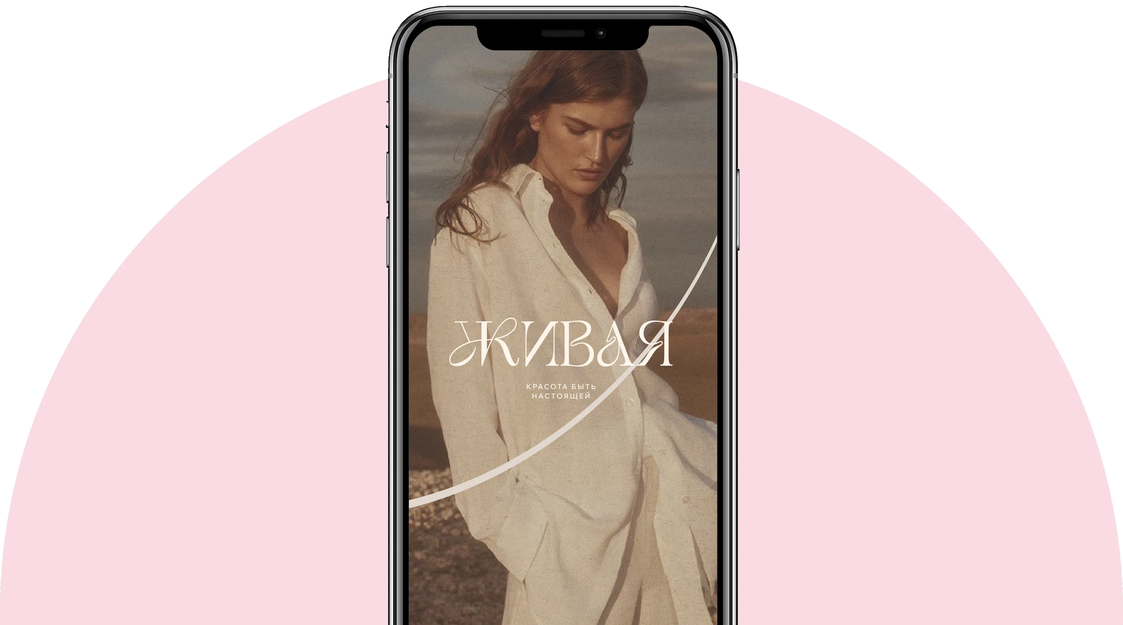
Zhivaya is a clothing brand for women who choose authenticity and value inner freedom. At the core of the brand is the idea of natural femininity without the need to conform to imposed standards. Clothing helps you feel true to yourself: each piece combines aesthetics, comfort, and meaning, becoming part of a woman's everyday life. Zhivaya speaks of beauty as an inner state — lightness, wholeness, harmony with body and self. The brand's mission is to create clothing that reminds a woman what it feels like to be alive, beautiful, light, and real.
CSG's task was to create a cohesive visual and conceptual system for the brand that would reflect its philosophy and work consistently across all communication touchpoints. We developed a brand platform, shaped the brand's positioning, values, and Tone of Voice. Based on it, we created a logo, monogram, color and font solutions, a system of additional identity elements, printed materials design, and social media visuals.
At the center of Zhivaya's platform is the idea of authenticity and returning to oneself. The brand addresses the modern woman who seeks balance between aesthetics, comfort, and her own sense of self. Its key values are authenticity, comfort and freedom of movement, naturalness, aesthetics and style, and inner transformation. We shaped the brand's character, audience profile, archetypes, visual code, and Tone of Voice. Communication is built softly, confidently, and sincerely — through the language of state, movement, touch, light, and inner freedom.
Zhivaya's visual system continues the philosophy of natural femininity and is built on a combination of lightness, tactility, and expressive details. The palette is based on warm brown, powder and pink shades, milky, and deep dark colors. An additional accent is gold, which adds a more expressive and premium character to the system. Typography combines an elegant antique font, a contemporary grotesque, and handwritten elements. As a result, the identity looks simultaneously feminine, modern, and emotional.



The main logo is built on fluid custom typography. The letters have non-standard connections and smooth lines, making the text perceived simultaneously as a word and an independent graphic image. Additionally, a shortened version of the mark based on the letter "Zh" was developed, along with several variations of its use with the brand star and the slogan "Beauty of Being Real." A separate part of the system became the monogram — a graphic mark of two smooth forms connected by an accent element. It can be used independently or in combination with the main logo.
To expand the visual language, we developed additional graphic elements, patterns, and brand symbols. The system uses stars, fluid lines, botanical forms, handwritten elements, and typography-based compositions. A separate pattern is built from the brand's texts and symbols — it allows for creating more saturated media while maintaining identity recognition. All elements are easily combined with each other and allow adapting the style for both minimalist and more decorative communications. Based on the identity, a system of printed materials and packaging was developed: labels, sewn-in elements, stickers, postcards, inserts, wrapping paper, boxes, and other media. The design uses the brand palette, logo, monogram, patterns, graphic symbols, and gold accents. As a result, physical materials become an extension of the brand's character and form a cohesive visual experience of interacting with Zhivaya.