Social media


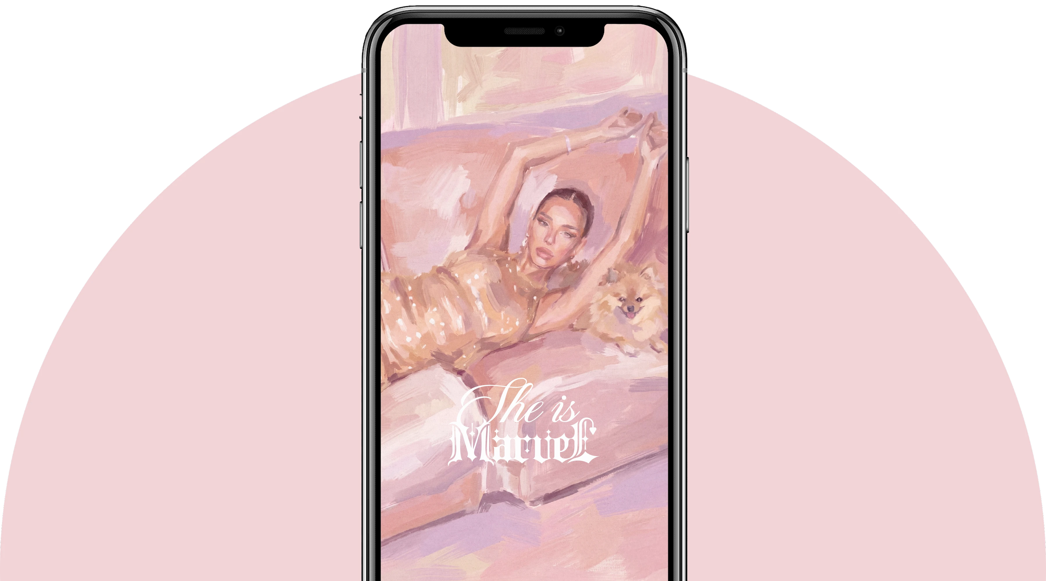
Marvel Design is a Russian womenswear brand whose story began in 2018. The brand specializes in creating expressive dresses, corsets, and pieces encrusted with crystals. At the core of each look are intricate handwork, attention to detail, and the idea of radiance as a woman's inner state. SHE IS MARVEL became a new imaginative dimension of the brand. This is a story about a woman who enters her own world and becomes its main heroine. Here femininity is revealed through sensuality, play, the beauty of details, and the freedom to be different.
CSG's task was to create a cohesive brand system that would preserve the recognizable sensuality of Marvel Design while giving the brand a deeper, more independent, and scalable image. It was necessary to develop a brand platform, logo, monogram, identity elements, color and font solutions, branded patterns, printed materials design, and a social media visual system. All elements had to come together into a unified visual world and support the brand at different stages of its development.
The platform is based on the idea of a personal wonderland created around a woman. SHE IS MARVEL invites the heroine to enter a space where desires take shape and clothing becomes part of her own story. The brand's world is built as the Marvel mansion. Each of its rooms reveals a new state of the heroine: romance, confidence, sensuality, playfulness, or grandeur. The brand does not offer the woman a ready-made role. It creates a space where she herself decides who to be today. The key values became individuality, bold femininity, the art of transformation, the beauty of details, and the freedom to create her own reality.
The visual concept develops the image of a fantasy mansion located on the border of the real world and the female imagination. Architectural graphics, open windows, mirrors, keys, rabbits, and decorative ornaments form a system of symbols through which the brand's story is revealed. The mansion's space becomes a metaphor for a woman's inner world, and each collection and product gets its own place within this universe. The project's aesthetics combine contemporary fashion presentation, fairy-tale motifs, rococo elements, and the feel of collectible visual art.


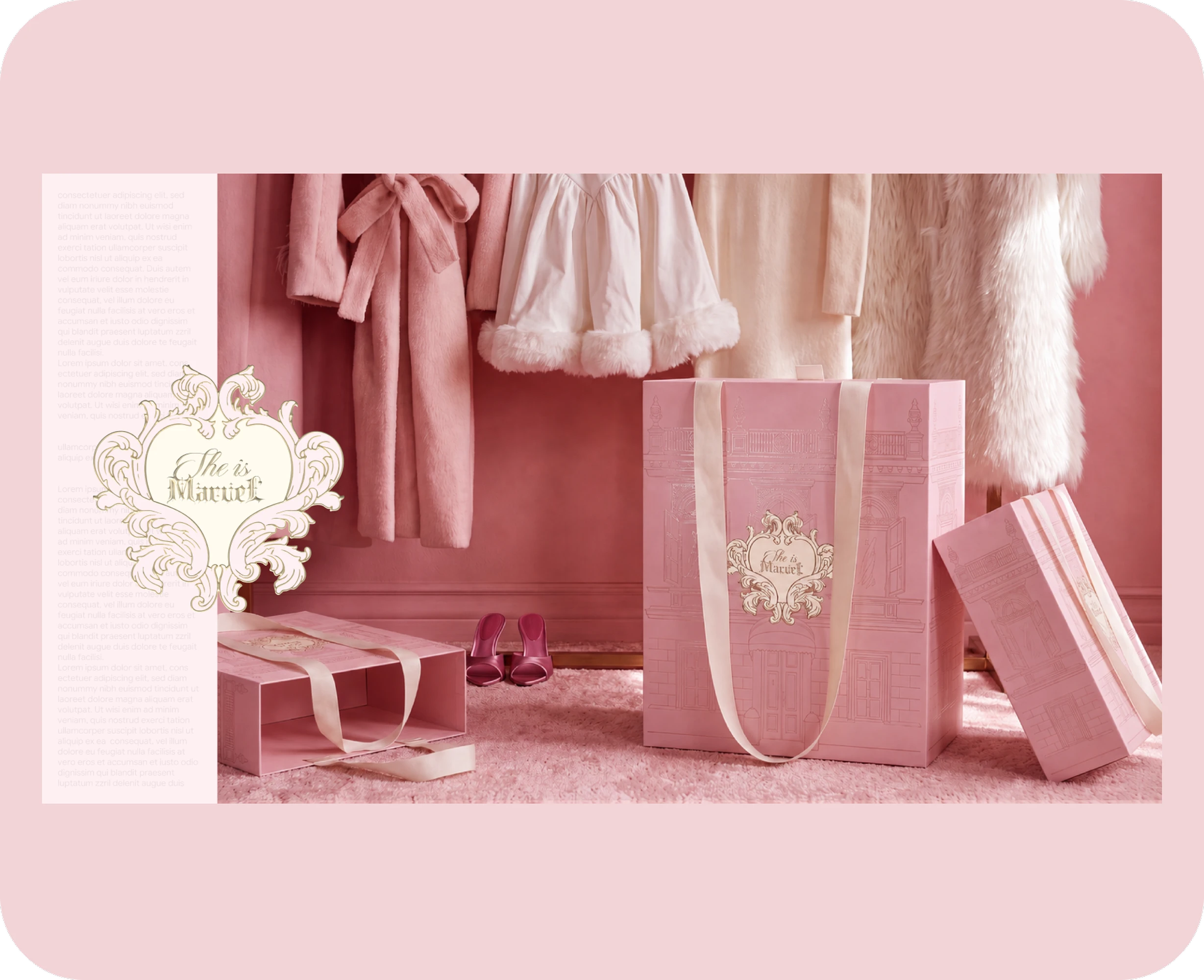


The corporate identity is built on a combination of decorativeness, airiness, and a precise compositional system. Its foundation consists of powder and milky shades, deep wine color, delicate gold, and complex paper textures. The soft palette creates a feeling of a private, almost intimate space. Contrasting wine elements add character and visual depth to the system, while gold details reinforce associations with preciousness, radiance, and high craftsmanship. The identity easily adapts to packaging, digital communications, printed materials, collections, and the brand's special projects.
A comprehensive system of printed and packaging products was developed for the brand: boxes, bags, envelopes, labels, postcards, certificates, product cards, instructions, and additional materials for order fulfillment. The Marvel mansion became one of the central images of the packaging. Its facade, windows, and architectural details turn each medium into part of a larger story. The order is perceived as a message from the brand's world, and the unboxing process becomes an extension of the customer experience. The design uses delicate ornaments, shaped edges, ribbons, textured materials, and gold embossing elements.