Social media


SHE creates clothing that reveals femininity, emphasizes individuality, and helps a woman feel more confident. The brand is built on three principles: quality, style, and empathy. The collections are based on refined silhouettes, expressive details, pleasant textures, and noble shades. In working on the products, the brand takes into account the features of the female figure and creates patterns that highlight her strengths. SHE combines romance, sensuality, and a modern view of the feminine image.
CSG's task was to create a cohesive and recognizable visual identity for SHE that would convey the brand's character and be consistently expressed across all touchpoints with the audience. It was necessary to develop a logo, branded graphics, color and font systems, printed and packaging materials design, social media visuals, and individual digital solutions for the website. The visual system had to look feminine and refined while maintaining a modern character and scalability.
The concept is based on the image of The House of SHE, a symbolic space created around the woman, her character, desires, and emotional states. The brand's visual world resembles a modern interpretation of a personal fairy tale. It combines heraldic forms, delicate decorative graphics, romantic symbols, and a soft color palette. Such a system creates a sense of intimacy while maintaining an expressive fashion character.
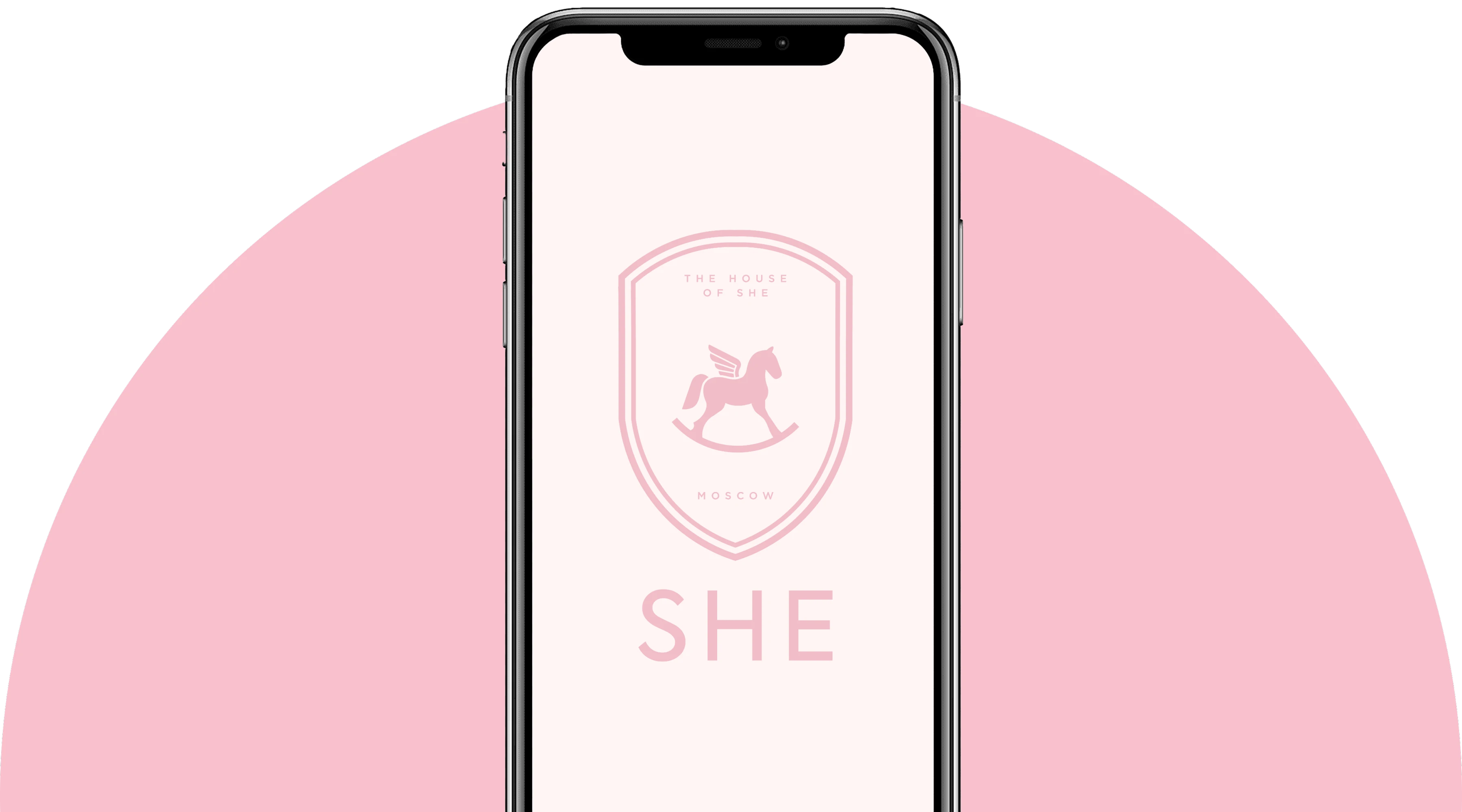
We developed a new SHE logo and its additional versions, a monogram, a system of branded symbols, typography, and a color palette. The core of the symbolic system became the image of a winged rocking horse enclosed in a heraldic shape. It unites associations with dreams, movement, lightness, and the brand's personal world. Additional elements with roses, swans, and decorative frames expand the identity and allow for diverse compositions without losing recognizability. Milky and powder-pink shades form a soft visual field, while concise typography balances the decorative graphics and makes the system modern.



As part of SHE's website development, we designed individual pages and interface solutions taking into account the existing online store structure. Special attention was given to the gift certificate page. We designed product presentation, certificate design options, information blocks, and the purchase user journey. The visual design continues the brand's corporate identity and integrates seamlessly into the site interface.
 FIGMA
FIGMA
 Tilda
Tilda
A standalone line of electronic gift certificates was created for SHE. We developed several design options adapted for different occasions and denominations. Additionally, integration with an electronic certificate service was carried out. The user can select a design and denomination, complete the purchase on the site, and receive a ready-made certificate in digital format.