Social media


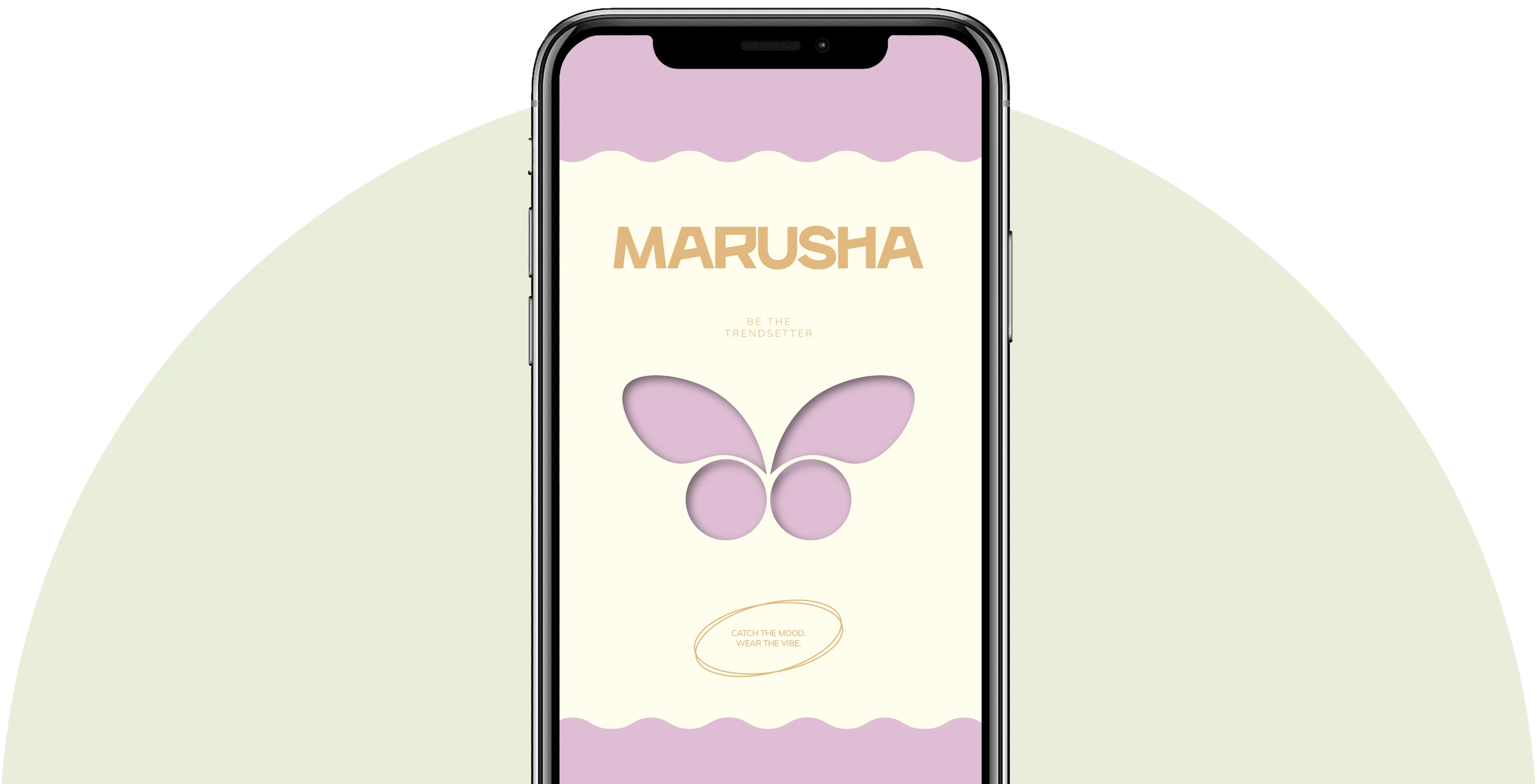
MARUSHA is a project where the visual identity is built around the idea of inner transformation, femininity, and constant renewal. It was important for us to create not just a recognizable design, but a cohesive system capable of evolving with the brand, collections, and audience mood. The project combines expressive symbolism, fluid typography, a thoughtful color palette, and tactile solutions for physical media. The resulting branding retains MARUSHA's character in every format while remaining alive, flexible, and open to further visual evolution.
Our team's task was to create a distinct visual language for MARUSHA that would convey the brand's philosophy and set it apart in a competitive environment. It was necessary to combine the project's emotional component with a clear commercial system: define positioning, formulate key meanings, develop a corporate identity, and prepare designs for the main media.
We defined the brand's character, its values, emotional territory, specifics of interaction with the audience, and principles of visual presentation. The central theme became rebirth as a natural process of inner development, personality disclosure, and transition to a new state.
MARUSHA's corporate identity is built on a combination of expressiveness, lightness, and visual plasticity. We developed a graphic system that supports the brand's emotional character and allows for creating diverse compositions without losing recognizability. Typography, color combinations, layout principles, and additional decorative elements work as parts of a unified visual language.



The key symbol of the identity became the butterfly, representing transformation, freedom, and the unfolding of a new form. This image is directly connected to the brand's idea: change is perceived not as a rejection of the past, but as a natural continuation of one's personal story. The butterfly appears in graphics in different scales and interpretations, becoming an independent decorative element, pattern, or meaningful accent.
Every element of the packaging works toward the overall impression, from the first visual contact to the moment of unboxing the product. The design turned out to be aesthetic, expressive, and suitable for creating UGC content.


The symbolism, compositional principles, typography, and graphic character remain unchanged, while color becomes a tool for renewal. One of the project's features was the ability to adapt the color system to the season, current visual trends, and the mood of the new collection. We initially created the identity so that changing the main shade would not destroy the brand's recognizability.
For the new season, we reimagined MARUSHA's color solution and showed how the corporate identity can sound new without a complete redesign.



As part of the project, we developed a clothing design concept for MARUSHA, uniting the product and corporate identity into a single visual system. The solutions were based on key identity elements: the butterfly image, fluid graphics, brand typography, and signature color combinations. We prepared options for placing prints, inscriptions, and decorative details on different clothing items so that the collection is perceived as a natural extension of the brand.