Social media


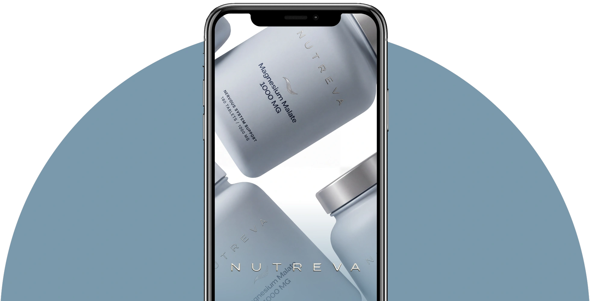
NUTREVA is a nutraceutical brand built around a mindful, systematic approach to self-care. Its philosophy is rooted in informed choice: composition, ingredient forms, product rationale and purpose should be transparent, while communication should help people understand the product without overload or marketing noise. The brand combines scientific aesthetics, a contemporary wellness approach and premium visual culture. NUTREVA speaks calmly and with reason, creating the image of a brand that values product quality, transparent information and a long-term approach to healthy habits over bold promises.
CSG was tasked with creating NUTREVA from the ground up as a cohesive brand: defining its positioning, communication style and a visual system that could scale across product categories and media. It was important to move beyond the supplement market's typical aesthetics, where communication often leans towards either pharmaceutical severity or excessively bright wellness imagery. NUTREVA needed its own visual language: technological, clean, contemporary and premium, yet understandable to people without a medical background.
NUTREVA's platform is built on conscious choice based on information rather than impulse. We defined the brand's positioning, mission, values, communication principles and meaning architecture. Evidence, transparency, consistency, accessible information and respect for the audience's intelligence became key concepts. NUTREVA does not communicate through fear or promises of instant results. Instead, it seeks to cultivate a more mature approach to nutraceuticals, where people understand what they choose, why they need a particular product and how it fits into their overall self-care system.
The brand palette is based on cool milky, silver, graphite and muted blue shades. They evoke laboratory precision and purity, while soft transitions, translucent textures and metallic details keep the visual language from feeling sterile. The typography system relies on concise geometry and generous white space. Expanded tracking, minimalist compositions and a clear information hierarchy allow the brand to work equally well on product packaging and in advertising and digital materials.



The visual identity was extended to the brand's print and service materials. We designed business cards, certificates, information inserts, cards, envelopes, bags, shipping packaging and additional product materials. All applications share a composition system, typography and visual logic, giving every interaction with NUTREVA a consistent character, from first acquaintance to receiving the product.
We also developed NUTREVA's social media design system and adapted the identity for digital communication. The system combines product materials, educational content, ingredient information, brand imagery and commercial messages while maintaining a consistent character. Profile images, backgrounds, templates and additional graphic elements make it possible to scale communication without losing recognition.


